Put Your Mobile Away and Shine a Light on the Forest
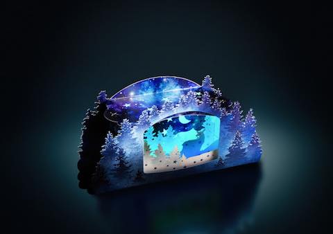
This year’s season’s greetings card from Iggesund Paperboard, is a mystical forest in the form of a pop-up shadow box with fine laser cut details and shimmering silver ink.

Using the recipient's mobile phone, it comes alive through a clever lightshow which mimics the magical illumination of the aurora borealis.

The theme, “Shine a light on the forest”, relates to the origin of Iggesund’s flagship product Invercote as well as the important role that sustainable forestry and fibre-based products can play in mitigating climate change. The concept was designed and created by Erik Hluchlan and Erin Fudge Smith at Structural Graphics, a print marketing agency with more than 40 years of experience when it comes to innovative packaging and print solutions.
Iggesund's season's greetings card has become somewhat of an annual challenge for designers to out-do the previous year's card by showcasing the countless possibilities of the company's paperboards, Invercote and Incada.
“Every year we wish the card to be eye-catching enough to earn its place on the recipient’s desk, or even on the mantelpiece at home. With this year’s card we also want to encourage people to put their phones away for a while,” says Jessica Tommila, Customer experience manager at Iggesund Paperboard. “We also want to show how much we value the long-lasting relationships we have with our customers and other friends in the packaging business.”
Structural Graphics, with its headquarters located in Essex, Connecticut, USA, works with paper and board in all forms to develop dimensional direct mail, interactive marketing materials that capture attention by "popping" to life, or intriguing designs that combine print with a digital element.
“My first thoughts on the assignment were about how lucky I was to have the opportunity to work on a project from Iggesund, as they have already produced so many amazing pieces,” says Erik Hluchan.
Hluchan’s idea was to create a magical forest scene pop-up in a darkened shadow box that could be illuminated from below by a mobile phone.
“Given the environmental theme of the project, a forest seemed obvious for a paperboard company. Iggesund by necessity needs to be a caretaker of forests,” says Hluchan, who went on to develop the greetings card with his colleague, Art Director Erin Fudge Smith.
The technically complicated greetings card placed a number of demands on the paperboard: It had to be opaque and have good foldability, while remaining rigid enough to maintain the form.
The material also needed to offer a higher quality of printability, according to Hluchan, who chose Invercote Creato 350 g/m2. “It is an excellent paper to work with when making pop-ups and it has the ability to withstand the high demands of dimensional paper engineering,” he says. “It is also able to handle a large number of print treatments including laser cutting.”
Invercote Creato is designed for both packaging and graphical applications. It offers equal, outstanding aesthetic printing properties on both sides. Both sides are fully coated and have a silk finish. Thanks to its composition of multiple layers of solid bleached primary fibres, Invercote Creato has a superior strength and toughness compared to board grades that contain mechanical or recycled fibres or even single-ply bleached primary fibre board.
Read more about the Iggesund Paperboard 2019 season’s greetings card at Iggesund.com/myforest.
